A landing page can be your home page, a standalone page for a specific product or service, or a category page within your site architecture. Besides getting more conversions, great landing pages have other benefits like better SEO rankings, the ability to promote a specific campaign, and making the buying process easier for your customer. If you want to design a landing page that will encourage customers to convert, we?ve outlined our best tips and tricks to help your company.
Step 1: Use a standout headline
A good headline is the first step to creating an effective landing page, it?s where you can first attract the attention of potential readers or customers. The headline should demand attention, tell the reader what the page is about, and it should be concise. Stick to headlines that are 10-20 words long, any longer and a reader could lose interest.
Step 2: Expand with subheadlines
Besides the main headline, you may want to expand to provide additional crucial information with a subheadline. A subheadline allows you to explain more without cluttering up the simplicity of the main headline.
In general, a subheadline will be placed directly under the main headline and should be persuasive. A subheadline can be more detailed and wordy than the headline. Depending on the setup of your website, you may want to place the subheadline above the main headline in some circumstances. There?s no one-size-fits-all formula for landing pages, so it?s important to think about the design of your website when thinking about your headers and subheaders.
Step 3: Don?t forget pictures
Adding beautiful visuals to your landing page is a great way to increase your site?s quality and user-friendliness. However, it?s important to make sure that the images are optimized so that they load fast on your page. Slow loading times can cause website visitors to immediately leave your page for greener pastures.
Stick to these rules when choosing images to accompany the text on your landing page:
- Make sure the pictures are adequately sized
- The images should have a connection to your service or relevant to your products
- If you?re a service-based company, make sure the image demonstrated relevance to the visitor
- Use high-quality, non-pixelated photos
- Use images to explain where words can?t
Step 4: Explain what you?re offering
Landing pages should make it crystal clear what you?re offering to the public. If a potential customer goes to your website but can?t figure out the point of your service or product, they?re not going to stick around to do a serious investigation to solve the mystery.
If your landing page is about just a singular product, you can probably focus on the headline and subheadline being the only copy. But if you need to explain a little more, you can also add more copy underneath.
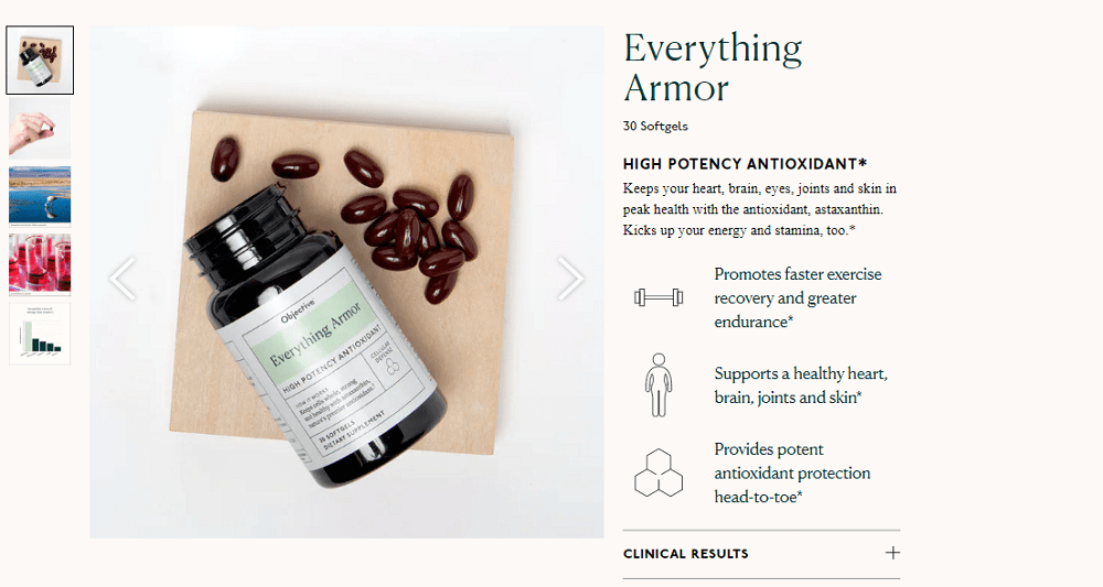
Check out this example for an Objective Wellness astaxanthin supplement called Everything Armor:

In this example, the company used a short headline that grabs your attention ?HIGH POTENCY ANTIOXIDANT?, followed by another short subheadline. Then, there?s an explanatory product description, product photos, and icon bullets that sum up the main benefits. This is an example of a clear, concise product landing page that gives the reader everything they need to know in one glance. Most importantly, all of this information is available ?above the fold,? so the reader doesn?t need to scroll down to get the essentials.
Step 5: Solve a common ?pain point?
If that suggestion reads a little negative to you, think of this way: if you can make someone think about something that annoys them or causes them an inconvenience, they?ll naturally gravitate to what solves that problem. That?s where your service or product comes in to save the day.
Here are a few ways to introduce a ?pain point? into your landing page copy:
- Talk about what someone will lose rather than just gain if they don?t use your service or product
- Try to highlight testimonials that emphasize pain points
- Make sure you offer a solution to the pain point (don?t just name problems without a fix!)
Step 6: Infuse joy
So, you might be confused since we just talked about how to incorporate a pain point into your landing page, well now it?s time to infuse a little joy, too. It?s important to not just talk about how a product or service will change a customer?s life (even on a small scale!) – it?s important to show them.
Step 7: Give customers a way to contact you
If you visit a company?s landing page and you are struggling to figure out how to contact the company, the landing page has failed. Legitimate businesses will offer customers access to its physical location, phone number, email, and a contact form.
You can even integrate a chat tool that utilizes a live customer service agent to answer visitors? questions. But, before you do so, make sure you do your due diligence and choose chat software that?s relevant for your needs.

Step 8: Use CTAs
A CTA, otherwise known as a call to action, is a great way to direct readers to complete a purchase. A call to action should be large and in button-form. Avoid using the word ?submit? and instead, use persuasive, exciting copy that encourages the visitor to act. Design-wise, it?s a good idea to use high-contrast colors to draw people?s attention. Make sure to place the CTA button above the fold so a customer doesn?t have to go on a scavenger hunt to figure out how to complete their purchase.
Here is an example of a great use of CTAs on American Casino Guide Book:
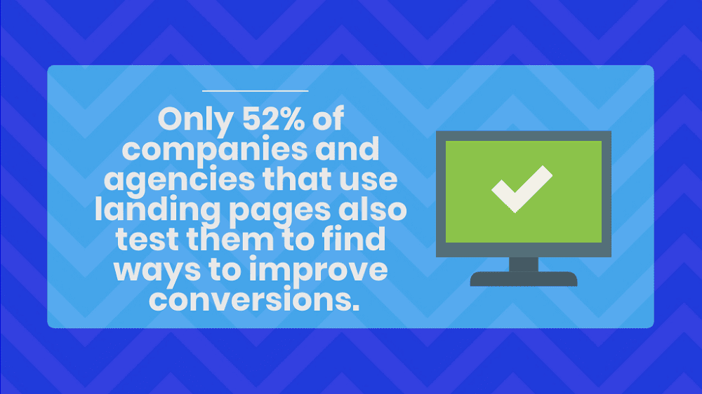
If you really want to go above and beyond, you can even test drive different versions of CTAs on your site to see what works the best!
Takeaways: Building an amazing landing page, one step at a time
If you own a website, it can be overwhelming trying to decide how to make the most of your landing pages. But if you stick to these guidelines, you can create a valuable landing page that converts a casual visitor into a customer. Remember to focus on quality content, CTAs, headlines, and images to showcase your product or service in the best light.
Author Bio
Samantha Rupp holds a Bachelor of Science in Business Administration and is the managing editor for 365businesstips.com. She lives in San Diego, California and enjoys spending time on the beach, reading up on current industry trends, and traveling.

As the editor of the blog, She curate insightful content that sparks curiosity and fosters learning. With a passion for storytelling and a keen eye for detail, she strive to bring diverse perspectives and engaging narratives to readers, ensuring every piece informs, inspires, and enriches.


